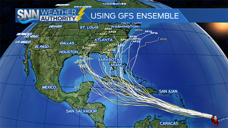
SARASOTA – We’re getting into the time of year where you see spaghetti plots shared on all social media. Each line (usually) represents one model for a given storm. Since models are available online to anybody, they don’t have to be shared by meteorologists and given any context.
The problem arises when people use spaghetti models to plan for a possible landfall. Spaghetti plots are not official forecasts. Official forecasts take all the models into account. They don’t simply take all the models and put the official track in the middle of it. Some models are updated more often, and some models are more reliable. You could also be sharing a picture with outdated information.
You’ve probably seen spaghetti plots like the one above frequently. While these aren’t all models available, they are some of the most frequent ones you’ll see. Global models are typically the best ones to use when determining a forecast. But you’ll often see non-global models on the plots. This is a list of some of the most frequent ones:
AVNO/AEMN/ABMI/AVNI – These are all variants/ensemble means of the American Global Forecast System model. You probably hear about this model, the GFS, frequently, along with the Euro. It updates every 6 hours.
CMC – This and others with similar names (such as the CEM) are variants of the Canadian global model. It updates every 12 hours.
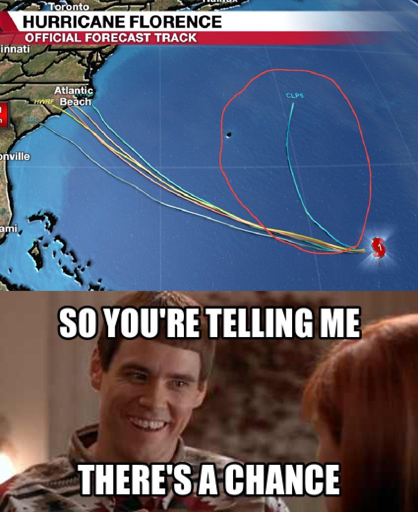
CLP5 – You will see this in so many plots, but it’s not a model that’s predicting where the storm is going. The CLP shows you where storms historically go from this location. This meme during Florence’s approach was shared on social media in 2018:
That’s the CLP5. While interesting as a comparison, it’s not a model. Disregard this line. It’s useless to you.
HWRF/HWFI – The National Weather Service’s forecasting model for hurricane. It updates every 6 hours. It’s not a global model.
IVCN – This is a model from FSU that is a blend of several intensity models.
NVGM – This is the Navy Global Environmental Model. This is helpful for forecasting.
OFCI/OFC2 – This is the National Hurricane Center’s official forecast. The National Hurricane Center frequently does better than any individual model because it takes into consideration all atmospheric variables, weighs the models, looks at all the ensembles, compares them to each other, and looks at which model has been doing better or worse recently or for this specific storm. It’s always best to just look at a graphic with the official track and cone when making decisions since an individual model won’t show you the whole picture.
SHIPS – This is a statistical model that takes information on factors such as sea surface temperatures and stability.
TABD, TABM, TABS – If you ever see these on a spaghetti plot, know that they’re deep, medium and shallow versions (how high you are in the atmosphere from 850 mb to 200 mb) of a model that estimate wind shear. Bottom line, they aren’t going to give you good information on the storm’s track.
TVCN – This is a consensus of at least two of GHMI, EGRI, NGPI, HWFI, GFSI, GFNI and EMXI. These are useful if you’re getting the most recent ones (remember that all these models on this list update every 6 – 12 hours).
UK – You’ll see variations of the UK Met Office’s model (UKM, UKX). It’s a global model, and it updates every 12 hours.
Now you know what these letters mean, but now you also know that not all of them are as reliable as others or mean the same as others. And if you’re sharing an old picture, you are sharing old, outdated models. In addition to that, the Euro model is not included in these spaghetti plots because it’s proprietary. So what’s the best way to look at medium to long-range possibilities? That’s where the global models — the Euro, GFS, UKMet, Canadian — do well.


